Still Life Painting - Telling stories about our lives
In this page we are going to take a look at the process behind starting and finishing a still life composition. This will be an exercise in illusion, rendering a three dimensional space on a two dimensional plane. If we follow the steps as they are laid out here then we should come pretty close to a product we would be happy hanging over the couch. This is just an exercise, for many starting out (or returning to) the easel the whole affair can seem a little daunting. Keep in mind that this is a process and with anything (winemaking, lovemaking etc.) it requires patience.....
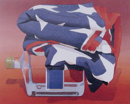
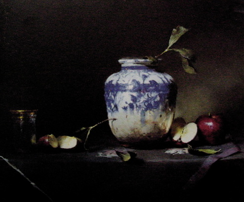
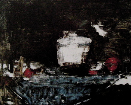
There are some examples of Still life painting in the gallery below, to help with some ideas for compositions that can build off of this project.
This is an intermediate-advanced project ......but hey don't let that stop you.....
These are the materials you will need:
9" x 12" Masonite (hardboard)
Acrylic Gesso
Source image/ charcoal (to transfer image on to the board)
Acrylic paint- Pthalo Blue, Cadmium Orange, Cadmium Red, Burnt Umber, Burnt Sienna,
Raw Siennna, Titanium White
Preparation
Materials: 9" x 12" masonite, Acrylic Gesso, 2" brush, 150 grit sandpaper, water
The following project was completed using acrylic paint on a 9" x12" gesso primed board. Any board could do, but the preference here is masonite, a common hardboard which could be found at the local big box hardware store. This is a good managable size if you are just starting out and still feel intimidated by the scale of larger scale stretched canvas. Apply 2 thin but even coats of Gesso to the board, set aside and let it dry (2 to 4 hrs.) Sand when dry.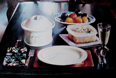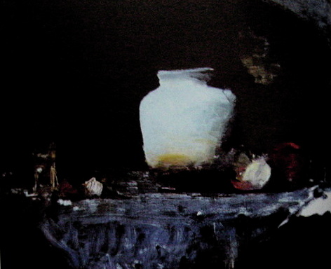
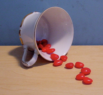
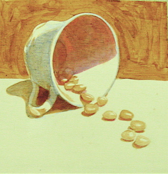
Cup o' Hearts
 Step 2 Transfer Image
Once you have your image then you can begin to transfer it to the surface of your primed board. The easiest and best way to do this is to take charcoal or graphite and rub the back of the image, make sure that the image is covered well enough. Return to the board and tape down and make sure the image doesn't move. Next use a ball point pen or hard leaded pencil and trace the contours of the image onto the board. The pressure of the pen/pencil should transfer the image directly onto the board. Now we are ready to begin to paint.... | Step 1 Transfer Image (step1)
The first thing to do is to select an image. If you are a beginner starting out then you are going to have to feel comfortable in the subject matter you choose, while still challenging yourself at the same time. The image to the right would be a good place to start. It involves elements of pictoral depth, shape, tonal value and foreshortening- all of the things that give beginners fits. The size of the piece relates to the format of an 8.5" x 11" paper. If you have access to a printer, right click on the image to the left, save the image to the desktop on your computer, and print out following the prompts in the printer presets. Charcoal Transfer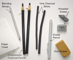
Below is a link to a quick video about transferring an image with charcoal... http://www.youtube.com/watch?v=SIDcaj_k1Qo |
 | Step 3 Under-painting
Just like any new construction you need a good foundation if you are going to build some thing lasting and worthwhile. Same goes with painting. A good underpainting lays the foundation for the layers of paint that go on overtop. Traditionally this is done monocromatically, using one color to complete it. This is the stage when we establish our shadows, our forms and our overall sense of depth. The paint should be thinned with water or acrylic matte medium- nothing too opaque. This is a vital step that should not be overlooked.... Brushes: no.6 flat, no.4 point Acrylic colour: Burnt Umber Water |
Step 4 Background
At this point we can start to add colour. A good rule of thumb is to work from the back to front. In this way we allow for the subsequent layers to "trap"up the layers of colour underneath. This is a good habit to establish and helps prevent the "halo"-ing of colour aroung your compostitonal elements. In this piece we are mixing a light blue tone using pthalo blue and some titanium white, thinned with water and a little bit of matte medium for the background, and Raw Sienna and some titanium white, thinned with water and a little bit of matte medium for the foreground.... Brushes: no. 6 Acrylic colours:Pthalo Blue, Titanium white (background) Raw Sienna, Titanium white (foreground) Water, Arcylic matte medium | 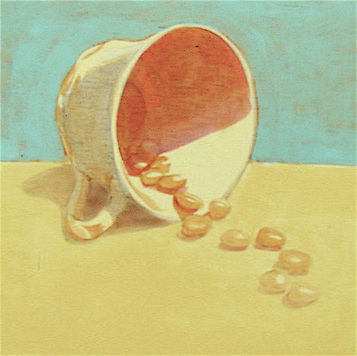 |
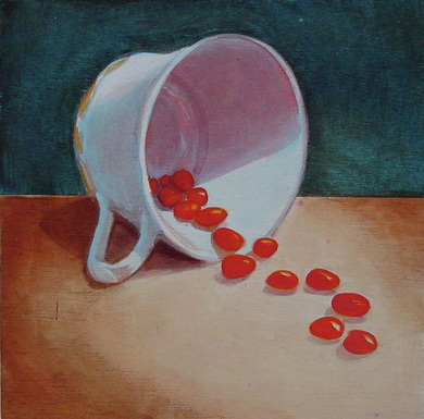 | Step 5 Blocking in Colour
The next step is to begin Blocking in the colour of the cup and the red candies. Lets address the cup first because in terms of pictorial space this element sits behind the red candies. To match the surface of the porcelin cup lets mix up a cooler white, by adding a little pthalo blue in with our titanium white, not too much blue as it is a very powerful pigment and seems to stain any colour that it mixes with. We don't want to go too opaque with this mix as we want the underpainting underneath to guide us as we begin to layer our colours on top. Once we establish our "cooler" white all over, (inside of the cup too) Then we can use Titanium White to build up and give us our highlights. After this we can address the red candies by mixing up a little Cadmium Orange as our base or body colour. To give the candies depth we will use Cadmium Red to give shape to the pieces. At this point we pretty much have all of our colour elements established and we can go after the details, such as the shadows and the highlights. Brushes: no. 6 Acrylic colours:Pthalo Blue, Titanium white (cup) Cadmium Orange, Cadmium Red (candies) Water, Arcylic matte medium |
Finishing Details
At this point we can start to add a little bit more depth to the composition by focusing on the contrast between light and dark values. Our palette involves alot of earth tones (Umbers, Siennas) which is what we will employ to emphasize our depth. Mix a little bit of Burnt Sienna and Pthalo Blue together, what you end up with is a version of a Paynes grey that is easily controled with either colour to boost it warmer or cooler depending on the feel of the painting. In my experience it is better to use mixed colours rather than reaching for black to adjust tonal value. The painting becomes more alive with colour richness that could become compromised or deadened by using black. Again, we want to avoid any opaque application of colour and work with the transparency of o0f the medium instead. The easiest way to determine adjustments of contrast is to squint at the source image and the painting, going back and forth. spending this time will determine what needs to be adjusted. At this point it becomes an exercise in push and pull- you want to push the shadows and pulll the highlights. This is also a fussy stage of the composition where we go back and forth between light and dark. At this point we should put the original away, for sanity's sake. We are not trying to recreate the picture on the page but instead trying to create our own painting that displays our own touch and sensibility. This is merely a stepping stone on the rocky road of visual art. Brushes: no. 6, no. 4 Acrylic colours:Pthalo Blue, Burnt Sienna Water, Arcylic matte medium | 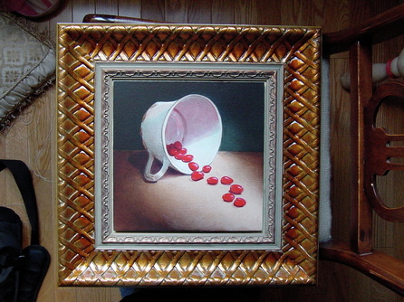 |
Gallery